标签:color span orb head mat yellow 范围 com 背景
1.设置图形要素的颜色
Plot函数中,使用col=参数来决定要素的颜色
如果不指定plot type,颜色加在散点上,如果指定了plot type,例如line,则颜色加在线上
其它函数,例如barplot()和histogram()也使用col=参数影响颜色
2.颜色的表示
①颜色名
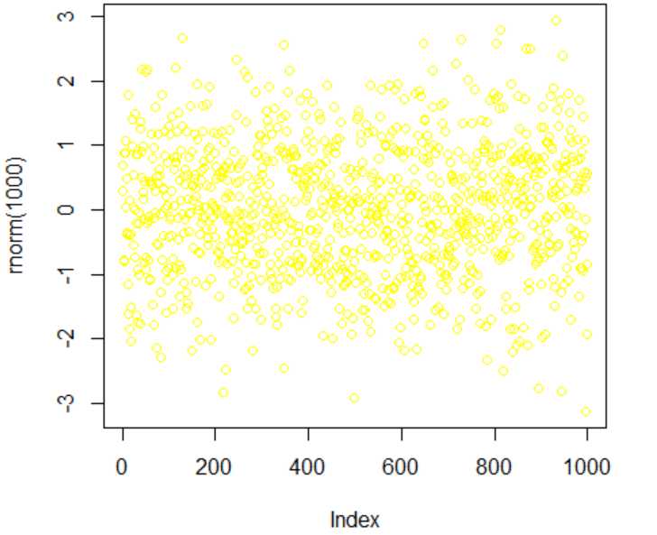
> colors()                             #查看所有颜色名
> plot(rnorm(1000),col="yellow")
②数值
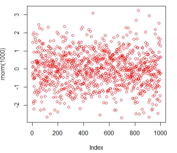
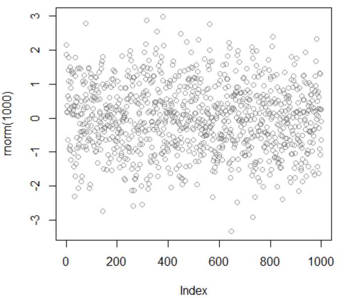
> palette()                                     #查看当前调色板 (缺省调色板下,1表示黑色,2表示红色,0表示背景色)
> plot(rnorm(1000),col="2")                     #数值为当前调色板上的颜色值
> palette(c("red","blue","green","orange"))     #改变缺省调色板
> palette()
> plot(rnorm(1000),col="2")
③十六进制
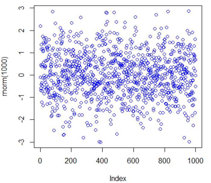
> rgb(0.5,0.5,0.5,0.8)                 #设置红色,绿色,蓝色,透明度的数值(范围为0-1)返回16进制表示
> plot(rnorm(1000),col="#808080CC")    #col参数为上一步的结果
3.多种颜色画图
①使用调色板控制包
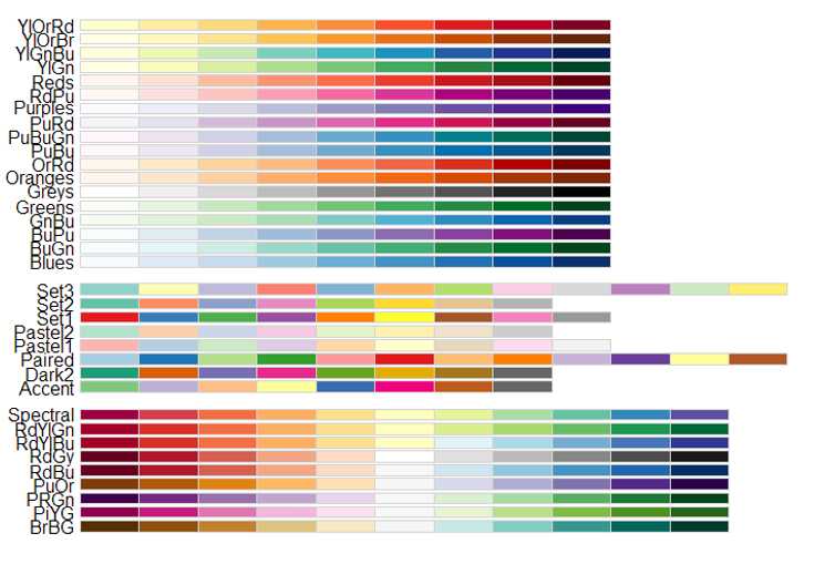
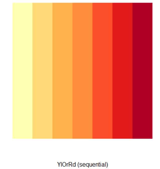
> library(RColorBrewer)                #加载调色板控制包
> display.brewer.all()                 #查看所有色板
> brewer.pal(7,"YlOrRd")               #替换缺省调色板
> display.brewer.pal(7,"YlOrRd")       #画图
②使用颜色名
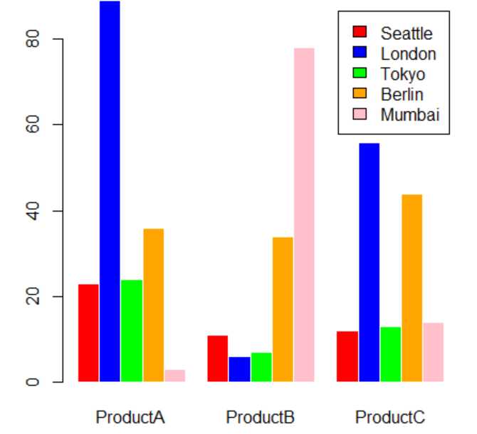
> sales<-read.csv("citysales.csv",header=TRUE)
> barplot(as.matrix(sales[,2:4]), beside=T,
+ legend=sales$City, #增加图例
+ col=c("red","blue","green","orange","pink"), #颜色数和样本数相等
+ border="white")
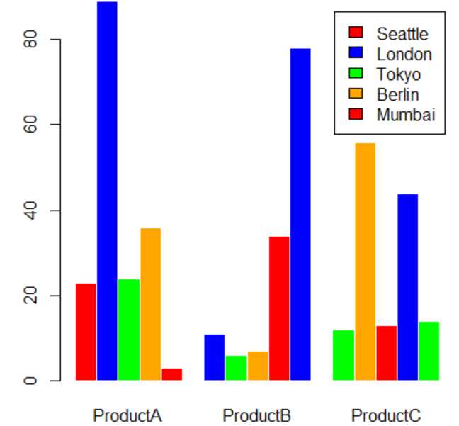
> barplot(as.matrix(sales[,2:4]), beside=T,
+ legend=sales$City,
+ col=c("red","blue","green","orange"), #颜色数和样本数不相等
+ border="white")
③使用函数
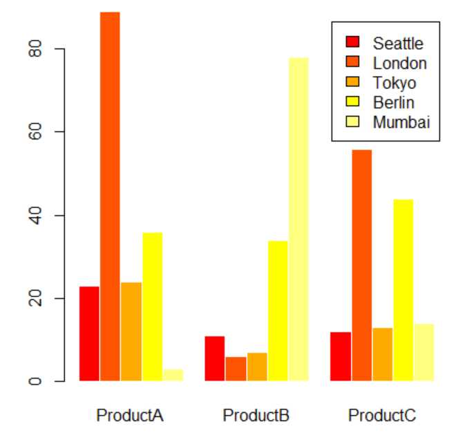
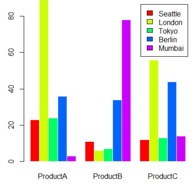
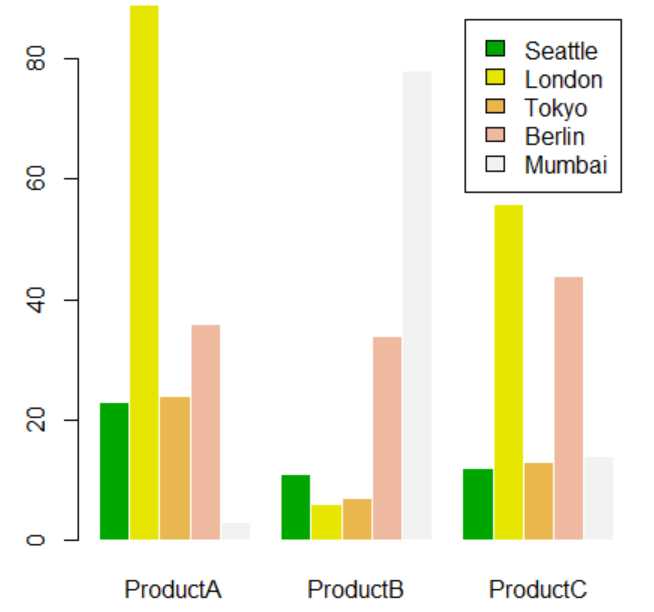
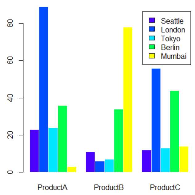
> barplot(as.matrix(sales[,2:4]), beside=T,
+ legend=sales$City,
+ col=heat.colors(length(sales$City)),
+ border="white")

> barplot(as.matrix(sales[,2:4]), beside=T,
+ legend=sales$City,
+ col=rainbow(length(sales$City)),
+ border="white")

> barplot(as.matrix(sales[,2:4]), beside=T,
+ legend=sales$City,
+ col=terrain.colors(length(sales$City)),
+ border="white")

> barplot(as.matrix(sales[,2:4]), beside=T,
+ legend=sales$City,
+ col=cm.colors(length(sales$City)),
+ border="white")

> barplot(as.matrix(sales[,2:4]), beside=T,
+ legend=sales$City,
+ col=topo.colors(length(sales$City)),
+ border="white")

标签:color span orb head mat yellow 范围 com 背景
原文地址:https://www.cnblogs.com/all1008/p/10043104.html