标签:nta btn col text ble add cancel 新建 height
最近在做小程序的登录,需要同时获取用户手机号和头像昵称等信息,但是小程序又不支持单个接口同时获取两种数据,因此想到自定义一个弹窗,通过弹窗按钮触发获取手机号事件。记录一下。
具体代码如下:
业务代码中:
在业务代码中引入dialog组件即可
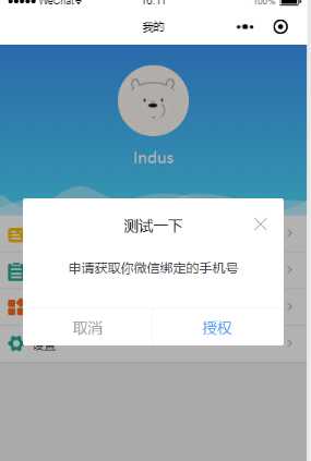
<dialog visible="{{dialogVisible}}" showFooter="{{footerVisible}}" title="测试一下">
<view class=‘dialog-body‘ slot="dialog-body">
<view class=‘dialog-content‘>申请获取你微信绑定的手机号</view>
<view class=‘dialog-footer‘ slot="dialog-footer">
<button class=‘cancel-btn‘ bindtap="close">取消</button>
<button open-type="getPhoneNumber" bindgetphonenumber="getPhoneNumber" class=‘confirm-btn‘>授权</button>
</view>
</view>
</dialog>
dialog组件:
component下面新建dialog。注意是 component 不是 page ,因为要作为组件引入到页面中
dialog.wxml:
需要传入四个属性
visible:是否显示弹窗
title :标题
showClose:是否显示右上角关闭按钮
showFooter:是否显示底部按钮
<!--components/dialog/dialog.wxml-->
<view class=‘dialog-custom‘ wx:if="{{visible}}">
<view class=‘dialog-mask‘ bindtap="clickMask"></view>
<view class="dialog-main">
<view class="dialog-container">
<view class=‘dialog-container__title‘ wx:if="{{title.length>0}}">
<view class=‘title-label‘>{{ title }}</view>
<view class=‘title-icon‘>
<image wx:if="{{showClose}}" bindtap=‘close‘ src=‘/images/close-btn.png‘></image>
</view>
</view>
<view class=‘dialog-container__body‘>
<slot name="dialog-body"></slot>
</view>
<view class=‘dialog-container__footer‘ wx:if="{{showFooter}}">
<view class=‘dialog-container__footer__cancel‘ bindtap="close">取消</view>
<view class=‘dialog-container__footer__confirm‘ bindtap=‘confirm‘>确定</view>
</view>
</view>
</view>
</view>
dialog.js
Component({
/**
* 组件的属性列表
*/
properties: {
visible: {
type: Boolean,
value: false
},
width: {
type: Number,
value: 85
},
position: {
type: String,
value: ‘center‘
},
title: {
type: String,
value: ‘‘
},
showClose: {
type: Boolean,
value: true
},
showFooter: {
type: Boolean,
value: false
},
},
/**
* 组件的初始数据
*/
data: {
},
options:{
multipleSlots: true
},
/**
* 组件的方法列表
*/
methods: {
clickMask() {
this.setData({ visible: false });
},
close(){
this.setData({ visible: false });
},
cancel() {
this.setData({ visible: false });
this.triggerEvent(‘cancel‘);
},
confirm() {
this.setData({ visible: false });
this.triggerEvent(‘confirm‘);
}
}
})
dialog.json:声明是组件就行
{
"component": true,
"usingComponents": {}
}
dialog.wxss
css可以根据自己喜好的样式调整,注意mask遮罩层的z-index高一点,确保在最上层
/* components/dialog/dialog.wxss */
.dialog-custom {
width: 100vw;
height: 100%;
position: absolute;
left: 0;
top: 0;
z-index: 9999;
}
.dialog-mask {
position: fixed;
top: 0;
left: 0;
right: 0;
bottom: 0;
z-index: 10000;
width: 100vw;
height: 100%;
background: rgba(0, 0, 0, 0.3);
}
.dialog-main {
position: fixed;
z-index: 10001;
top: 50%;
left: 0;
right: 0;
width: 85vw;
height: auto;
margin: auto;
transform: translateY(-50%);
}
.dialog-container {
margin: 0 auto;
background: #fff;
z-index: 10001;
border-radius: 3px;
box-sizing: border-box;
padding: 40rpx;
}
.dialog-container__title {
width: 100%;
height: 50rpx;
line-height: 50rpx;
margin-bottom: 20rpx;
position: relative;
}
.dialog-container__title .title-label{
display: inline-block;
width: 100%;
height: 50rpx;
line-height: 50rpx;
font-size: 36rpx;
color: #000;
text-align: center;
}
.dialog-container__title .title-icon{
width: 34rpx;
height: 50rpx;
position: absolute;
top: 0;
right: 0;
}
.dialog-container__title .title-icon image{
width: 34rpx;
height: 34rpx;
}
.dialog-container__body {
padding-top: 10rpx;
font-size: 32rpx;
line-height: 50rpx;
}
.dialog-container__footer {
height: 76rpx;
line-height: 76rpx;
font-size: 32rpx;
text-align: center;
border-top: 1px solid #f1f1f1;
position: absolute;
bottom: 0;
left: 0;
right: 0;
}
.dialog-container__footer .dialog-container__footer__cancel {
width: 50%;
color: #999;
display: inline-block;
}
.dialog-container__footer .dialog-container__footer__cancel::after{
position: absolute;
right: 50%;
bottom: 0;
content: ‘‘;
width: 2rpx;
height: 76rpx;
background: #f1f1f1;
}
.dialog-container__footer .dialog-container__footer__confirm {
color: #3B98F7;
width: 50%;
display: inline-block;
text-align: center;
}
微信小程序封装自定义弹窗
标签:nta btn col text ble add cancel 新建 height
原文地址:https://www.cnblogs.com/Indus/p/10826418.html