标签:mat UNC ati 中间 css 速度 alternate ash 另一个
1.过度:transition:它是一个缓慢的滑翔过程,就相当于一个缓冲,显得不是那么的突兀;
官方的解释是我们为了添加某种效果可以从一种样式转变到另一个的时候,无需使用Flash动画或JavaScript
过渡的属性:
transition-property: width; ----使用过渡的css属性名称(可不写,默认为过渡全部需要过渡的css属性)
transition-duration: 1s; ----过渡效果花费的时间(必须写)
transition-timing-function: linear; ----过渡效果的时间曲线(可不写,默认为先快后慢,即ease)
transition-delay: 2s; ----过渡效果何时开始(可不写,默认为立即发生,即0)
连写时它可以有四个值:
transition:使用过渡的css属性名称,过渡效果花费的时间,过渡效果的时间曲线,过渡效果何时开始
如:
transition:width 1s linear 2s; 即:css宽度属性,花一秒时间过渡,状态为匀速,延迟两秒发生过渡
当需要不同css属性过渡不同的时间时,可以将它们分别列出。
如:
transition:width 4s,height 3s,transform 2s;
这里的过渡属性还可以设置全部的属性进行过渡(all),还可以指定某一个属性进行过渡,但是有的属性是不可以进行过渡的就比如说:display:none/block;我们这里的隐藏都是通过opacity:0~1之间进行转换的。
接下来我们举个栗子:
<!DOCTYPE html>
<html>
<head>
<meta charset="UTF-8">
<title></title>
<style type="text/css">
.box {
width: 160px;
height: 160px;
background-color: #ff0000;
/*过渡效果*/
transition: background-color .5s ease-out 0s, border-radius .35s ease-in 0s;
}
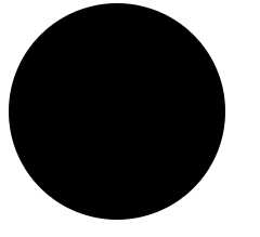
.box:hover {
background-color: #000;
border-radius: 80px;
}
</style>
</head>
<body>
<div class="box"></div>
</body>
</html>
效果图:
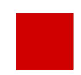
过渡后:
接下来我们看动画:
实现动画效果两要件:
1、首先要定义一个动画 ,定义一个@keyframes 规则(关键帧)
2、调用动画 动画定义好之后,使用animation 属性调用动画
动画得属性值:
animation属性取值
@keyframes 规定动画
@keyframes name{
from {属性从开始}
to {到属性结束}
}//这里面就是动画得精髓
animation 所有动画属性的简写属性,除了animation-play-state属性
animation-name 规定@keyframes 动画名称
animation-duration 规定一个动画完成的周期所花费的秒或毫秒。默认值为0,
animation-timing-function 规定动画的速度曲线。默认值为ease
animation-delay 动画开始前等待的时间。取值可为负(-2s 动画跳过 2 秒进入动画周期),属性不兼容 IE 9以及更早版本的浏览器.
animation-iteration-count 规定动画播放的次数。默认值为1
animation-direction 规定动画是否在下一周期逆向地播放。默认值是normal
animation-play-state 规定动画是否正在运行或暂停。默认值是running
animation-fill-mode 规定对象动画时间之外的状态
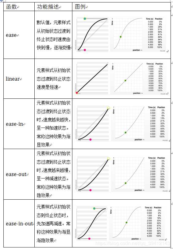
animation-timing-function 属性取值
linear 匀速(线型过渡)
ease 先慢后快再慢
ease-in 先慢后快
ease-out 先快后慢
ease-in-out 开头慢结尾慢,中间快
我这找的了一张的animation-timing-function 属性取值的运动过程图:
我们同样来举个例子来看下:
<!DOCTYPE html>
<html lang="en">
<head>
<meta charset="UTF-8">
<title>动画</title>
<style>
div{
width:400px;
height:400px;
background:red;
position:relative;
animation-name:mycolor;
/*animation-name规定@keyframes 动画名称*/
animation-duration:5s;
/*animation-duration规定一个动画完成的周期所花费的秒或毫秒*/
animation-timing-function:ease;
/*animation-timing-function规定动画的速度曲线*/
animation-delay:2s;
/*animation-delay规定动画何时开始。默认值为0*/
animation-iteration-count:infinite;
/*animation-iteration-count规定动画播放的次数*/
animation-direction:alternate;
/*animation-driection规定动画是否在下一周期逆向地播放*/
animation-play-state:running;
/*animation-play-state规定动画是否正在运行或暂停*/
}
@keyframes mycolor
{
0% {background:red;left:0px; top:0px; }
25% {background:yellow; left:200px; top:0px;}
50% {background:blue;left:200px; top:200px}
75% {background:green;left:0px; top:200px;}
100% {background:red;left:0px; top:0px;}
}
</style>
</head>
<body>
<div></div>
</body>
</html>
这个例子可以试一下;
标签:mat UNC ati 中间 css 速度 alternate ash 另一个
原文地址:https://www.cnblogs.com/zhangli123/p/12172127.html